100%Remaining
Beyond Game Works Logo
Intelligence Archive

SELECTED
WORKS.

A comprehensive overview of our most impactful collaborations, showcasing our technical expertise in environment design, asset optimization, and cinematic visual development.
ROLL TOGETHER - 1
ROLL TOGETHER - 2
ROLL TOGETHER - 3
ROLL TOGETHER - 4
ROLL TOGETHER - 5
Project Analysis

ROLL TOGETHER

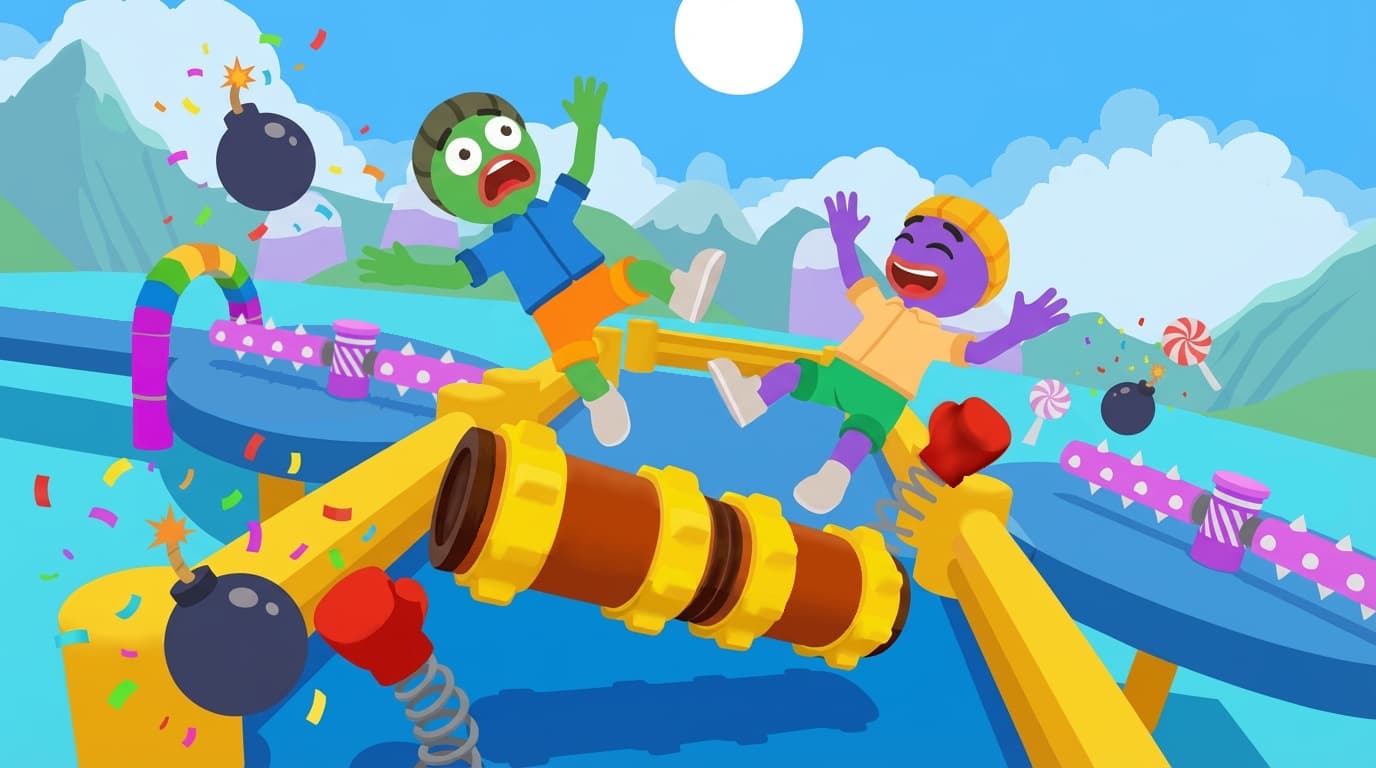
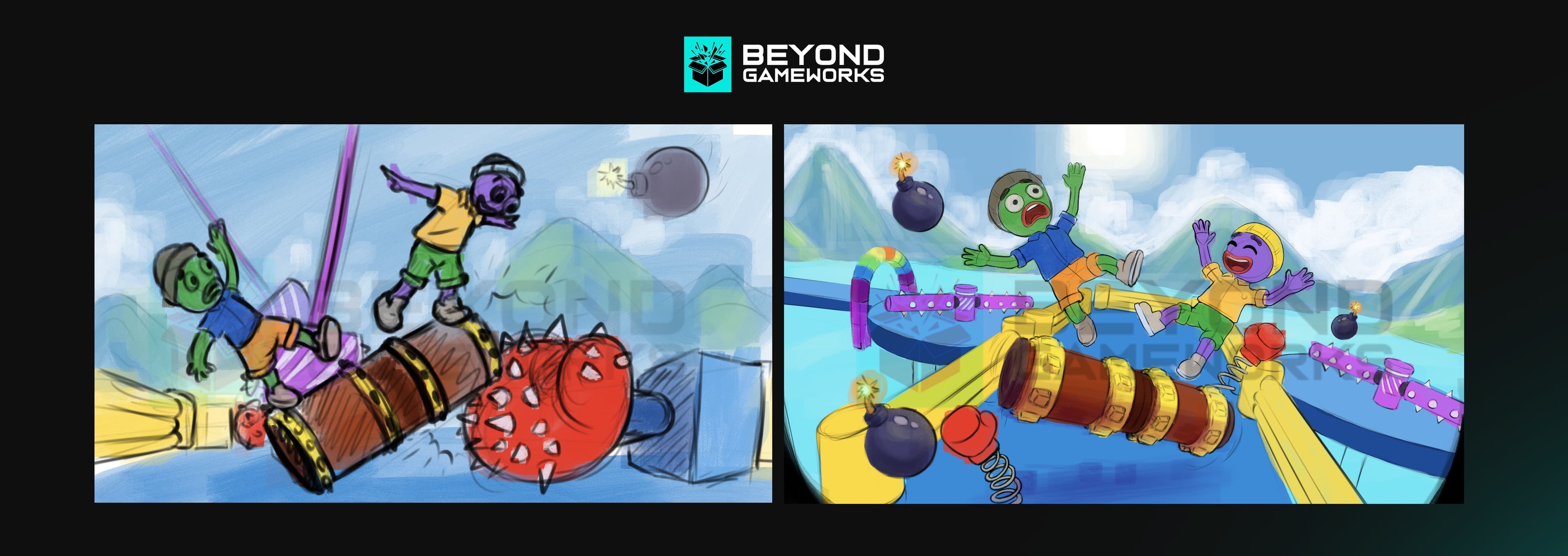
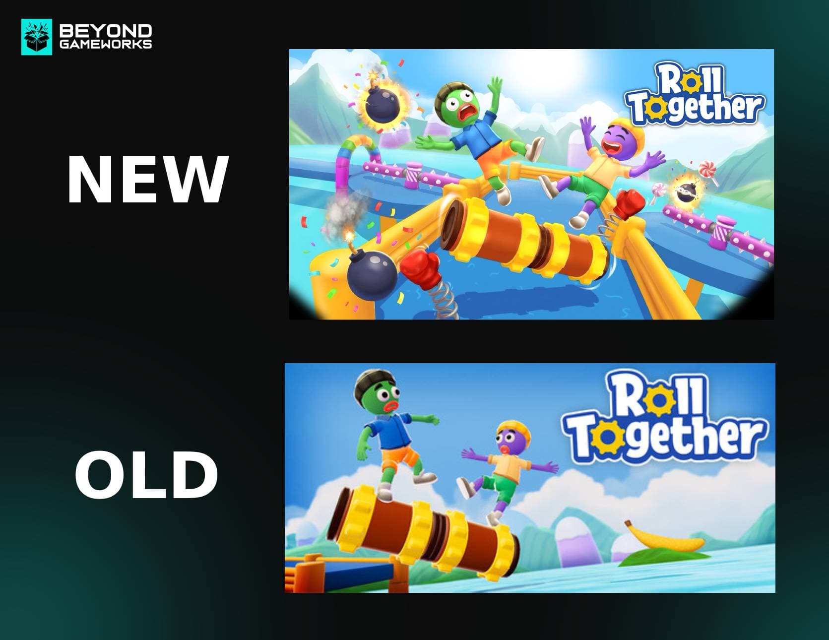
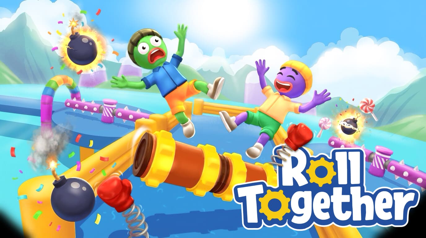
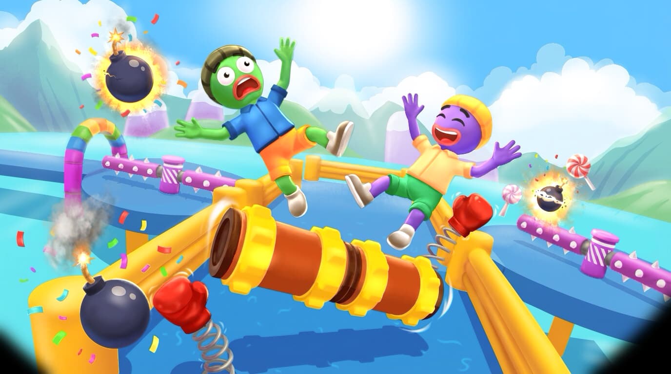
Capsule art for a chaotic co-op physics platformer, taking the concept from an early character mockup to a final Steam ready capsule. The direction leans into pure comedic chaos (two ragdolling characters mid launch off a giant rolling contraption) built to instantly communicate the game's friendship test premise the moment someone scrolls past it.

Technical Documentation
Roll Together is a chaotic co-op physics platformer where two players share control of a massive Roller, one steering the left wheel, the other the right, with momentum based physics that send characters flying whenever coordination breaks down. For the capsule art, our studio handled the full pipeline: early concept sketches exploring the characters' expressions and mid air poses, a mid stage pass building out the rolling contraption, hazards, and colorful outdoor setting, and a final polished illustration ready for store placement. The goal was to capture the game's core comedy (trust, chaos, and instant regret) in a single frame that reads clearly even at thumbnail size. We pushed the ragdoll poses and panicked expressions through several passes to make sure the humor landed instantly, then layered in bombs, confetti, and candy themed hazards to reinforce the playful, slightly unhinged tone of the game. The final piece balances two bright, simple characters against a busy obstacle course backdrop, with bold rounded logo type anchoring the composition so the game's identity stays clear even in a crowded storefront grid.
THE REALM SURVIVOR RPG - 1
THE REALM SURVIVOR RPG - 2
THE REALM SURVIVOR RPG - 3
THE REALM SURVIVOR RPG - 4
THE REALM SURVIVOR RPG - 5
THE REALM SURVIVOR RPG - 6
Project Analysis

THE REALM SURVIVOR RPG

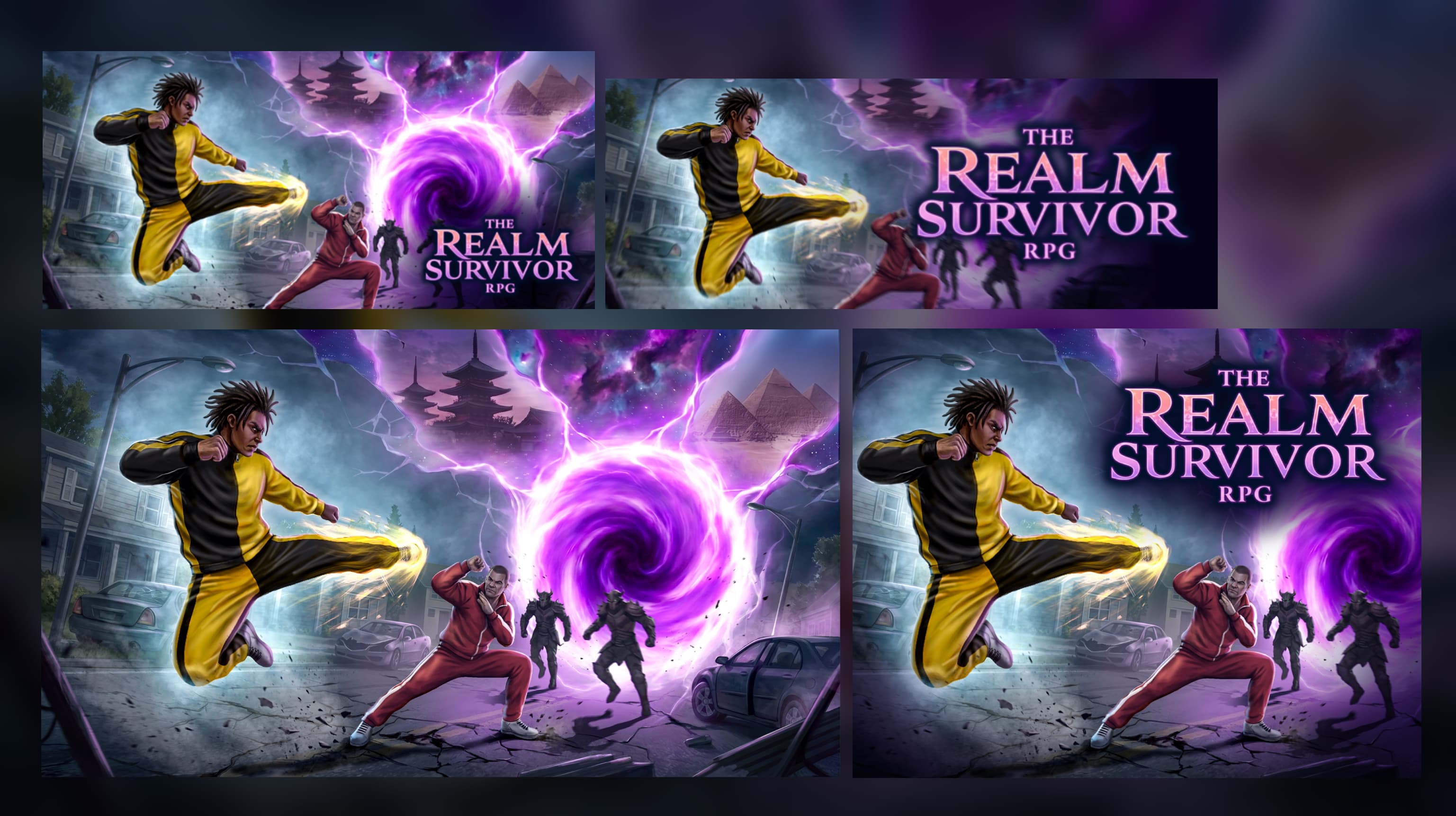
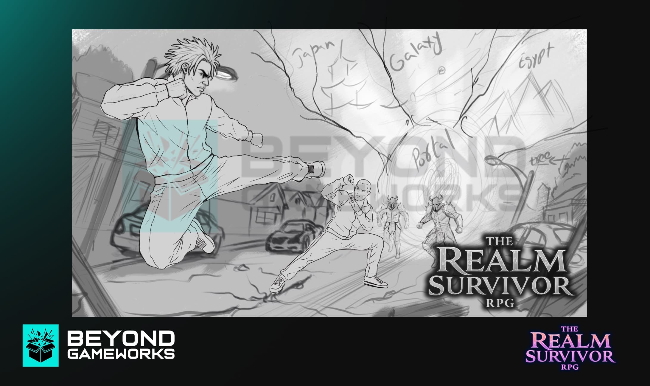
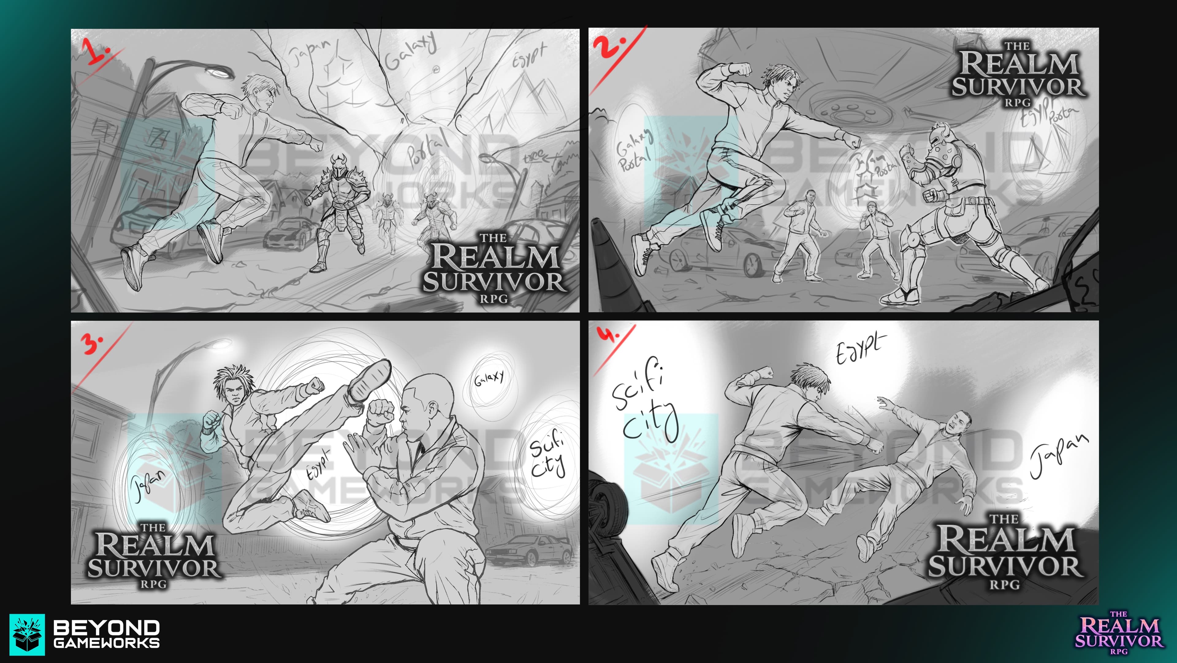
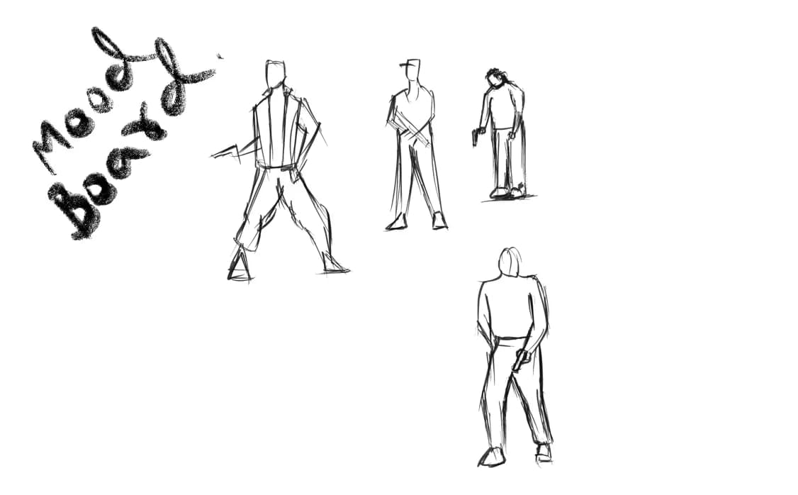
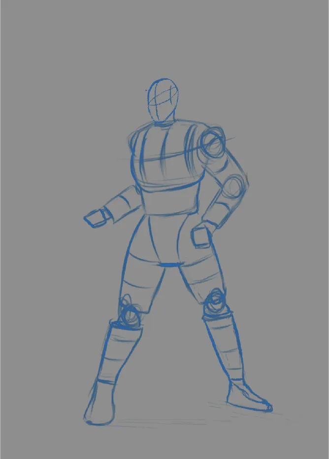
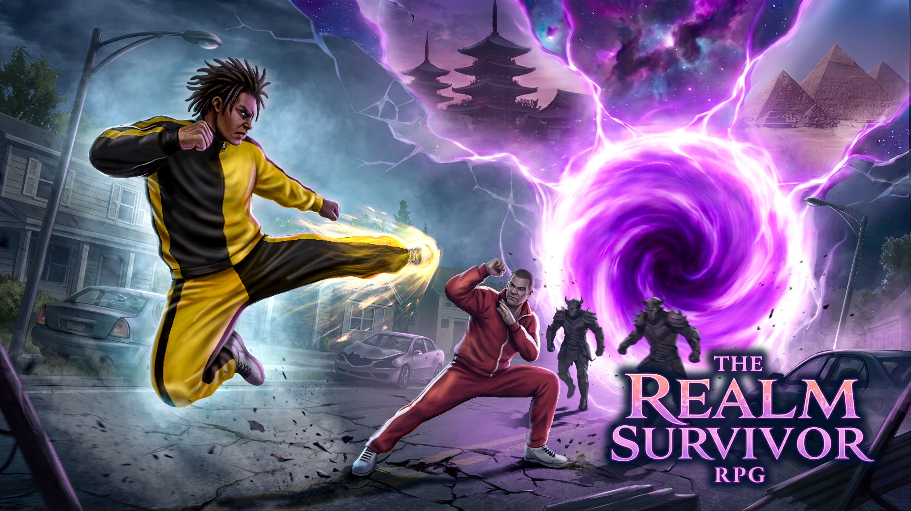
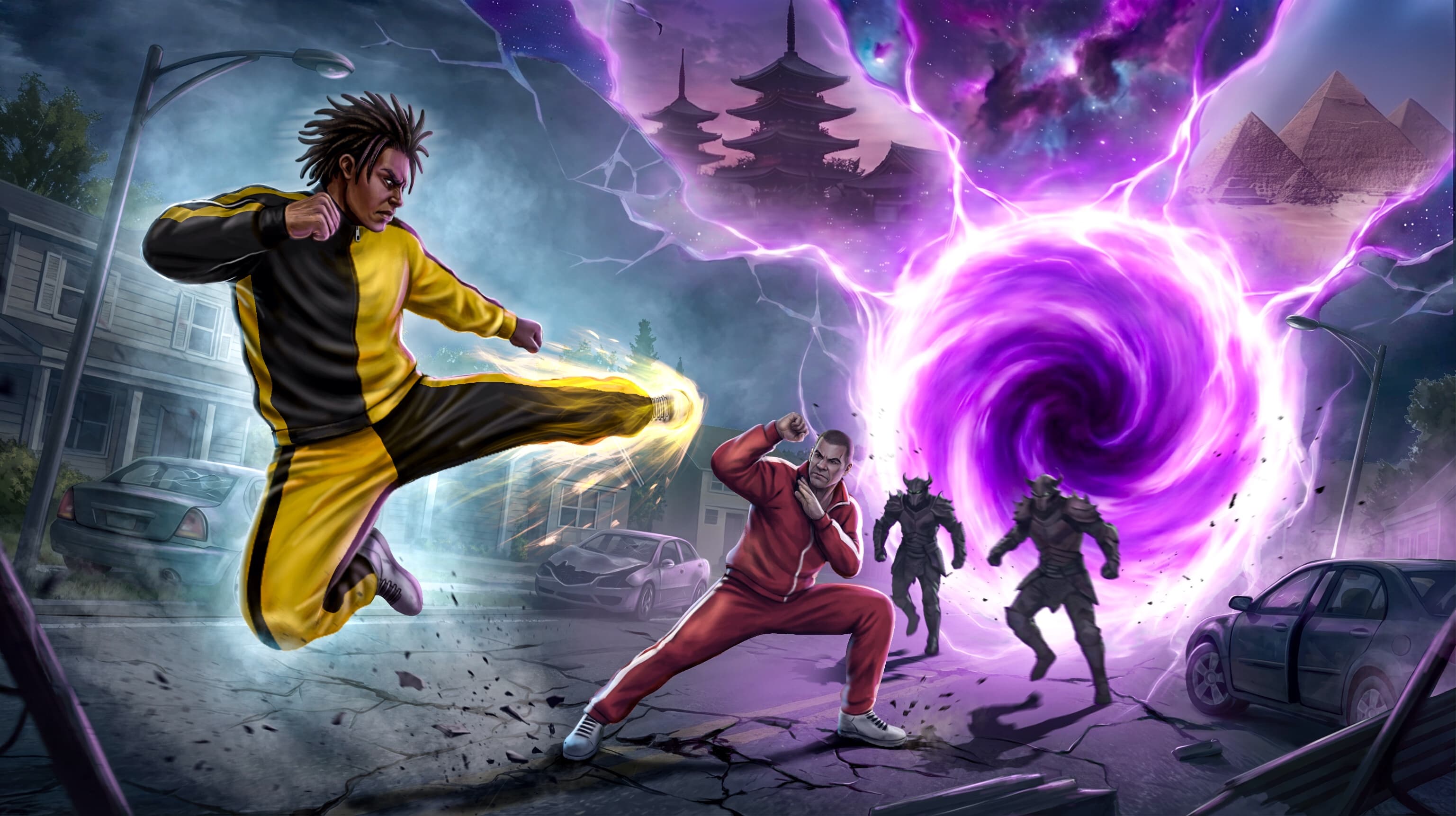
Capsule art for an urban open world RPG beat 'em up, taking the game from a rough concept brief to a final Steam ready capsule. The direction leans into high impact martial arts action set against a swirling interdimensional portal, built to stop the scroll on a crowded storefront.

Technical Documentation

The Realm Survivor RPG is an urban survival RPG where players fight gangs, robots, ninjas, and orcs across different realms after time itself breaks down. For the capsule art, our studio handled the full pipeline: concept sketches exploring composition and pose, a mid stage pass locking in lighting and the portal focal point, and a final polished illustration ready for store placement. The goal was to capture the game's core fantasy (martial arts combat colliding with realm hopping chaos) in a single frame that reads clearly even at thumbnail size. We iterated through multiple thumbnail sized tests to make sure the composition held up at Steam's small capsule dimensions, refining the character silhouettes, the portal's color intensity, and the balance between foreground action and background atmosphere. The final piece pairs a dynamic two character standoff with a glowing purple vortex as the centerpiece, framing the game's time travel premise while keeping the focus squarely on the fight.
Explosive Exchange - 1
Explosive Exchange - 2
Explosive Exchange - 3
Project Analysis

Explosive Exchange

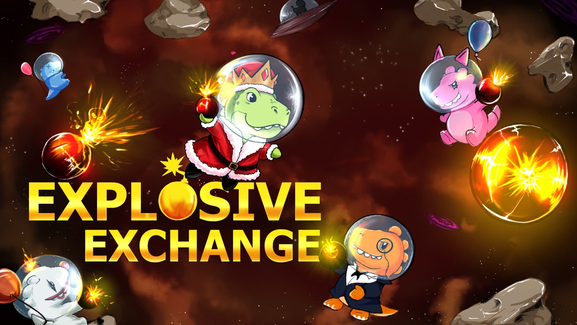
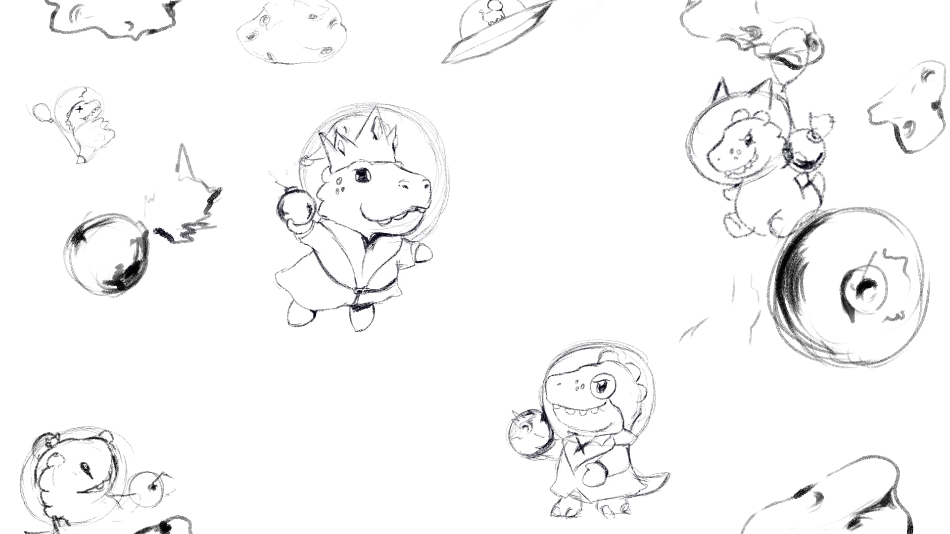
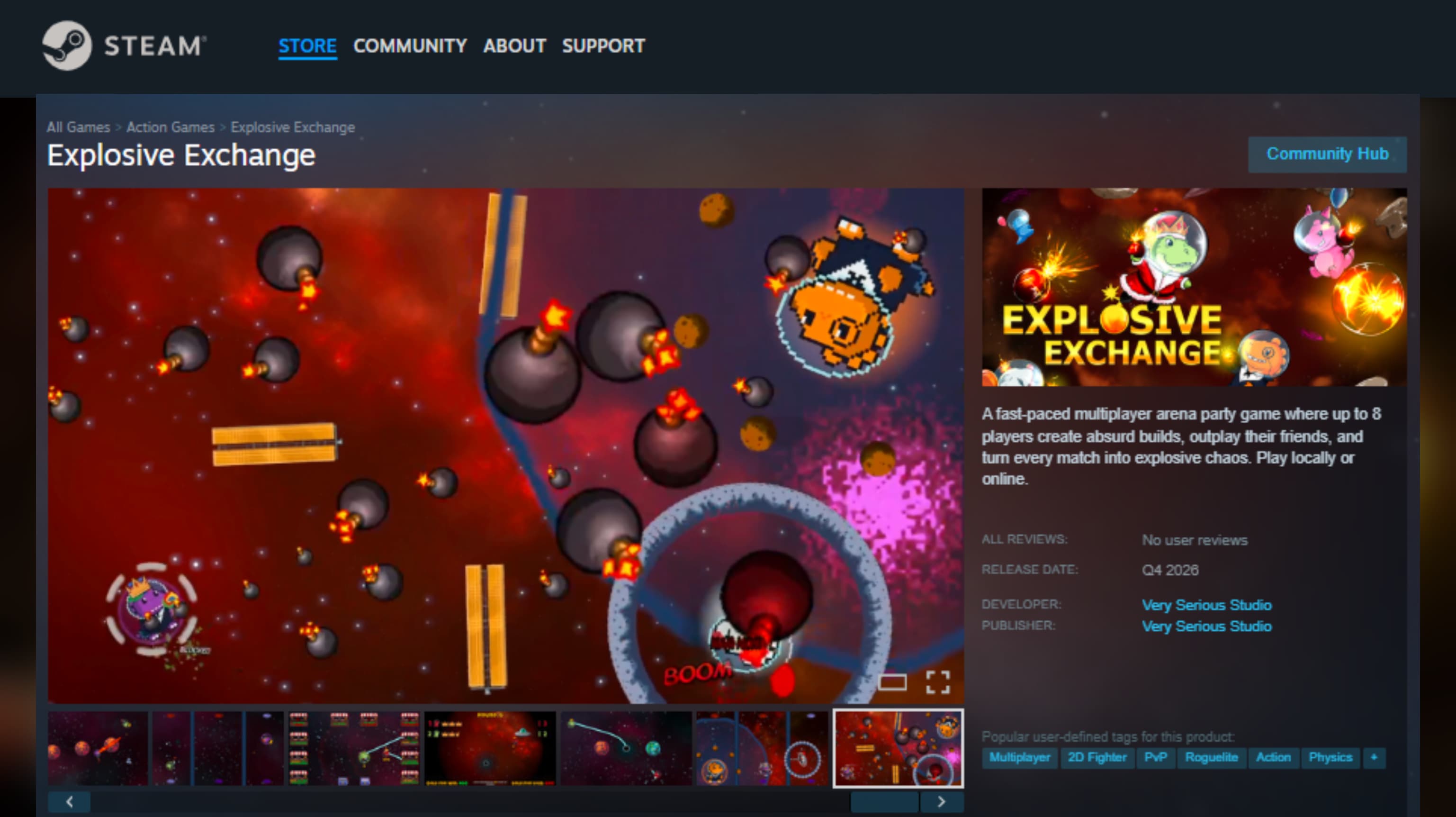
Capsule art for a chaotic multiplayer party game, taking the concept from a rough character lineup to a fully finished space themed capsule. The direction leans into playful, mascot style creatures in astronaut helmets, framed by fiery explosions and bold glowing typography built to grab attention on a crowded storefront.

Technical Documentation

Explosive Exchange is a fast paced multiplayer arena party game for up to 8 players, where absurd builds and unpredictable upgrades turn every match into chaos. For the capsule art, our studio handled the full pipeline: early concept sketches exploring the creature cast and their personalities, a mid stage pass building out the astronaut helmet motif and explosive color palette, and a final polished illustration ready for store placement. The goal was to give each character (from the crowned dino in a Santa coat to the grinning hippo with a bomb in hand) enough personality to read instantly, while tying the whole scene together with a warm, chaotic space backdrop. We pushed multiple passes on the explosion effects and lighting to make sure the "explosive" theme felt alive rather than decorative, balancing the glowing bomb spheres against the cast so neither one overpowers the frame. The final piece leans into bright, saturated color and expressive character poses, giving the capsule a fun, mascot driven identity that signals party game energy the moment someone scrolls past it.
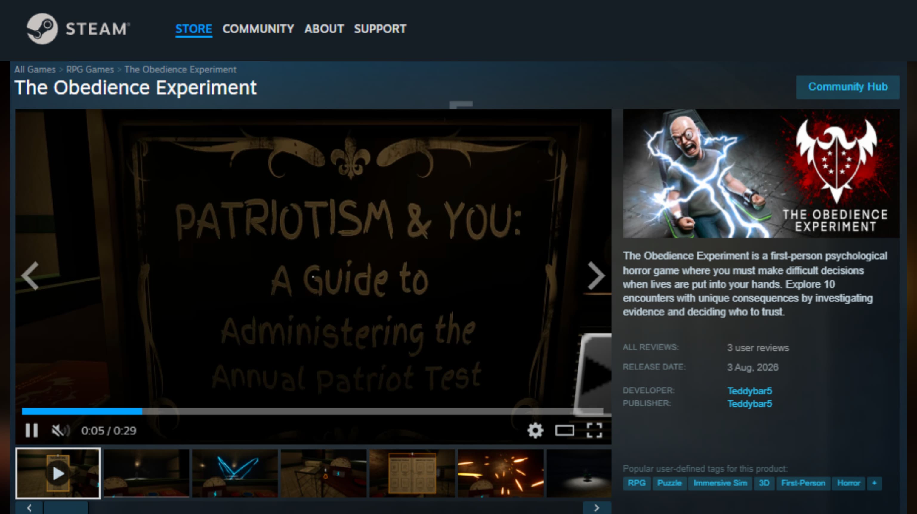
THE OBEDIENCE EXPERIMENT - 1
THE OBEDIENCE EXPERIMENT - 2
THE OBEDIENCE EXPERIMENT - 3
Project Analysis

THE OBEDIENCE EXPERIMENT

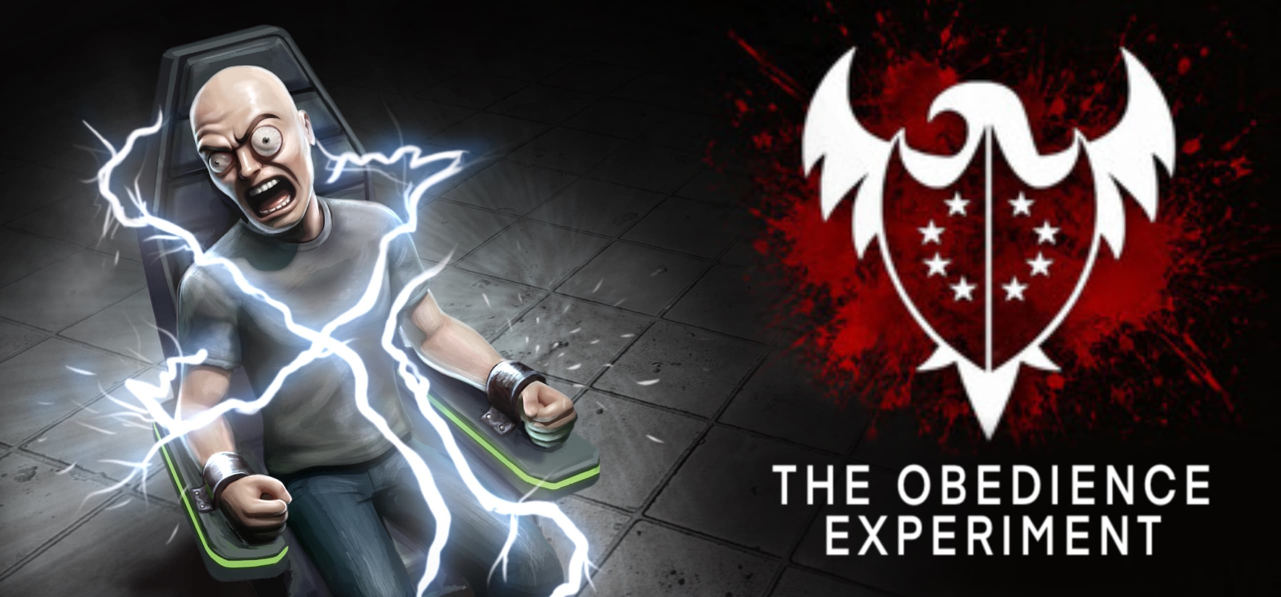
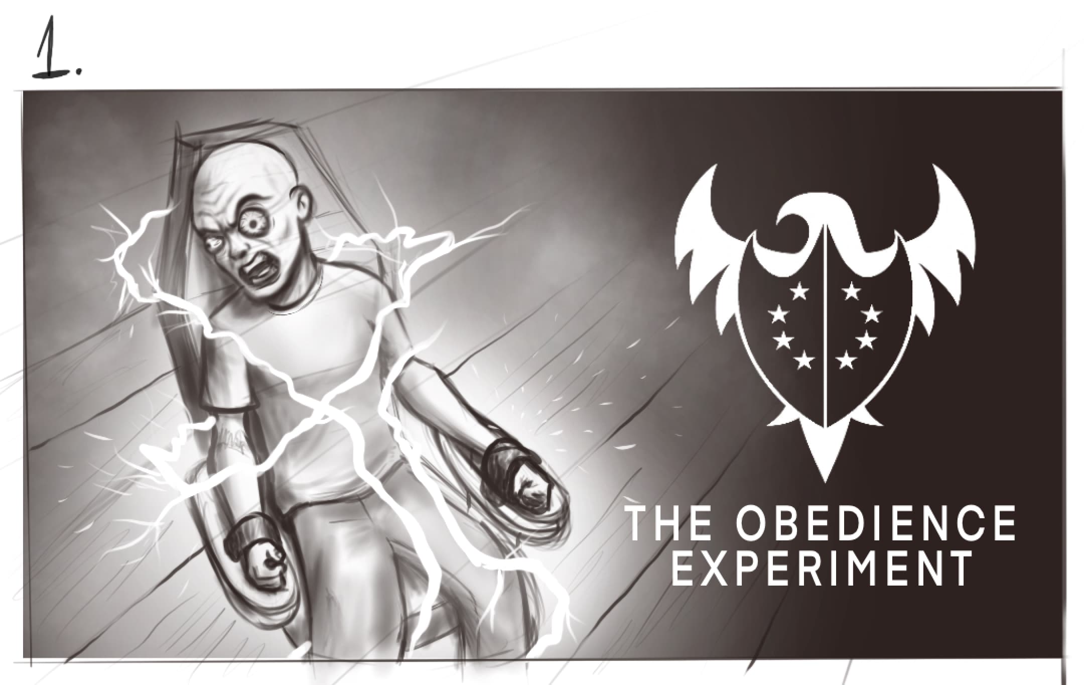
Capsule art for a first person psychological horror game, taking the concept from an early character study to a final Steam ready capsule. The direction leans into raw, unsettling tension (a man mid electric shock against a stark interrogation cell) paired with a bold heraldic crest, built to signal dark, morally charged horror the moment someone scrolls past it.

Technical Documentation
The Obedience Experiment is a first person psychological horror game where players investigate evidence, interrogate subjects, and decide whether to shock or spare them across 10 voice acted encounters. For the capsule art, our studio handled the full pipeline: early concept sketches exploring the subject's pose and expression, a mid stage pass developing the electric shock lighting and interrogation room atmosphere, and a final polished illustration ready for store placement. The goal was to capture the game's core tension (obedience versus resistance, under literal and figurative shock) in a single frame that reads instantly even at thumbnail size. We refined the character's expression and the crackling shock effect through several passes to make sure the emotion landed clearly, distress, defiance, and vulnerability all at once, before pairing it with a stark red and white crest that gives the capsule an institutional, almost propagandistic edge. The final piece balances a semi realistic character illustration against bold flat iconography, giving the game an identity that feels both grounded and unsettling on the storefront.
Gaye Mandi - 1
Gaye Mandi - 2
Gaye Mandi - 3
Gaye Mandi - 4
Gaye Mandi - 5
Gaye Mandi - 6
Gaye Mandi - 7
Gaye Mandi - 8
Gaye Mandi - 9
Gaye Mandi - 10
Gaye Mandi - 11
Gaye Mandi - 12
Gaye Mandi - 13
Gaye Mandi - 14
Gaye Mandi - 15
Gaye Mandi - 16
Gaye Mandi - 17
Gaye Mandi - 18
Project Analysis

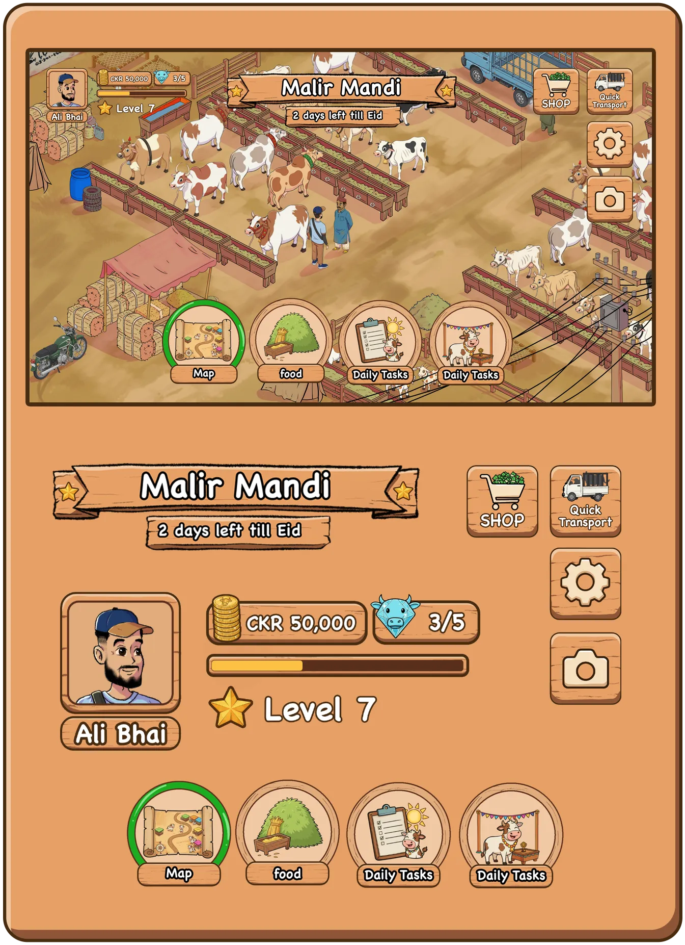
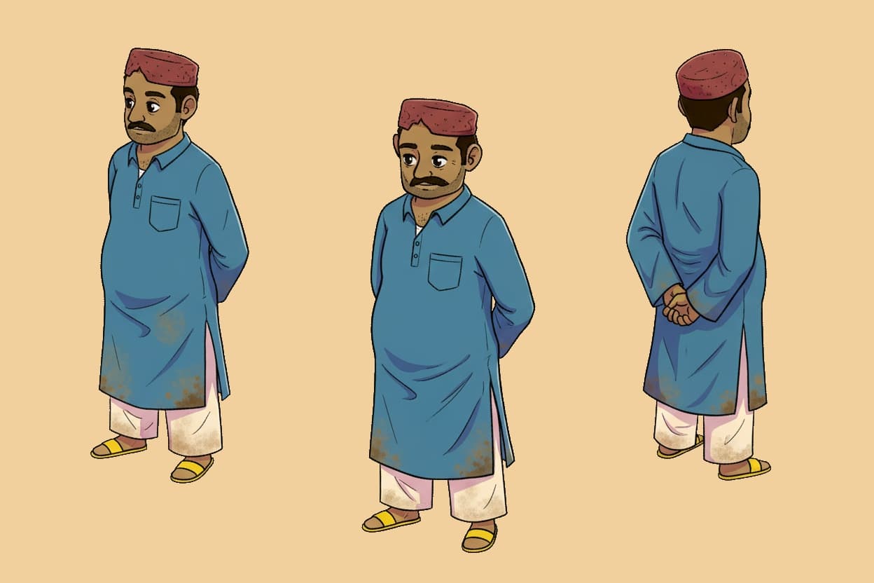
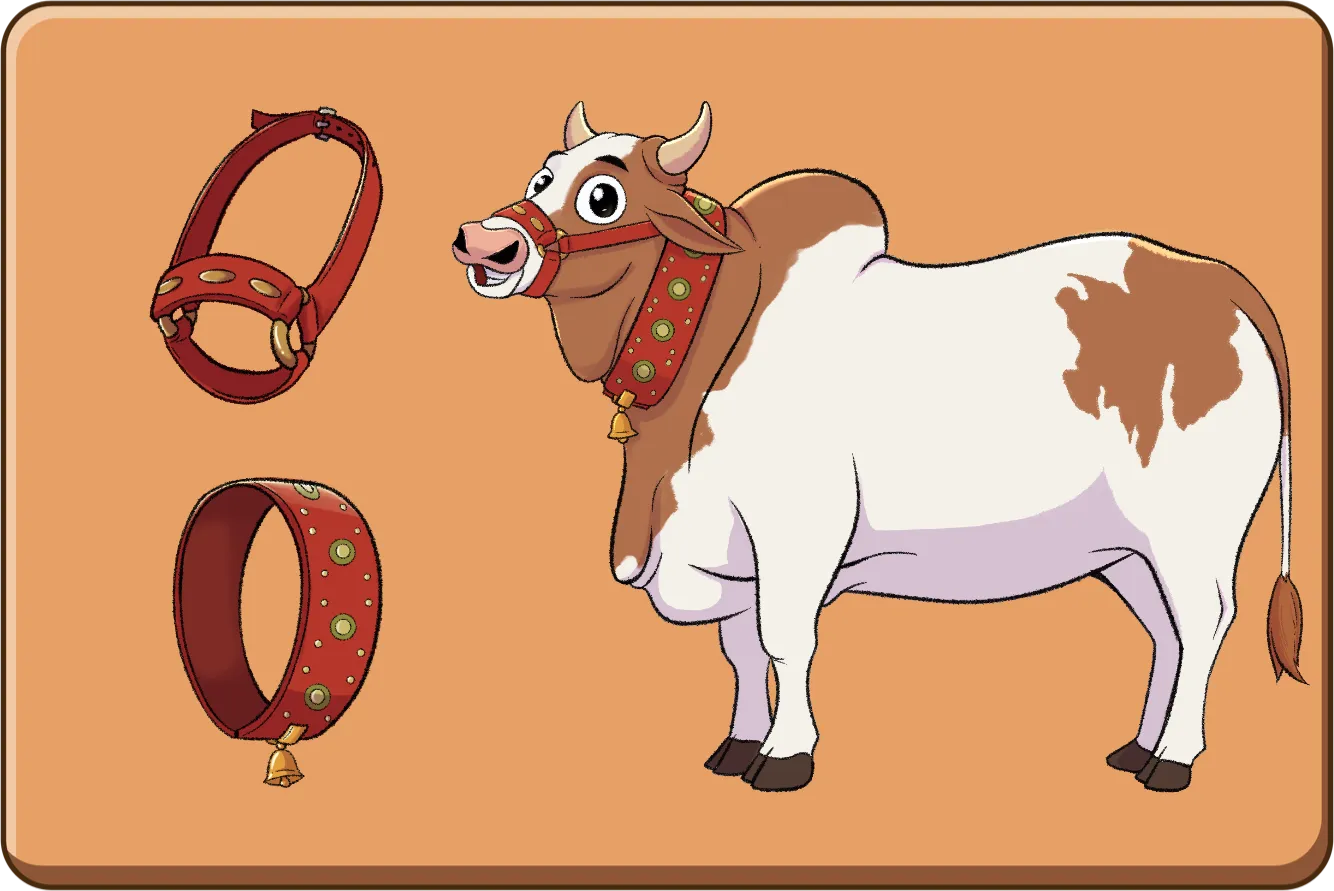
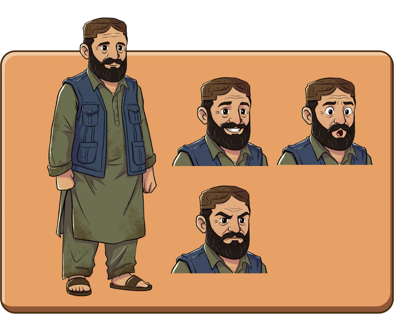
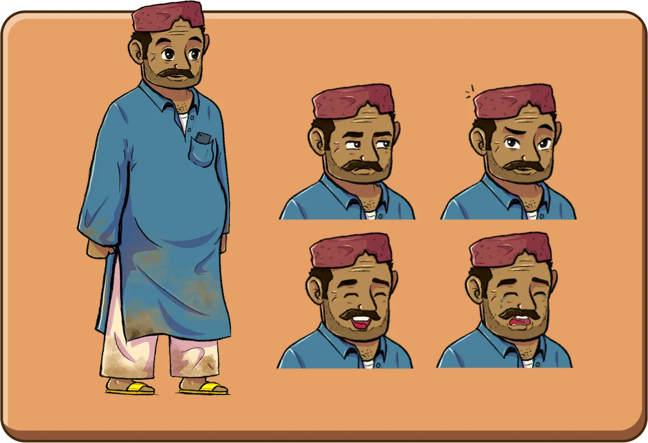
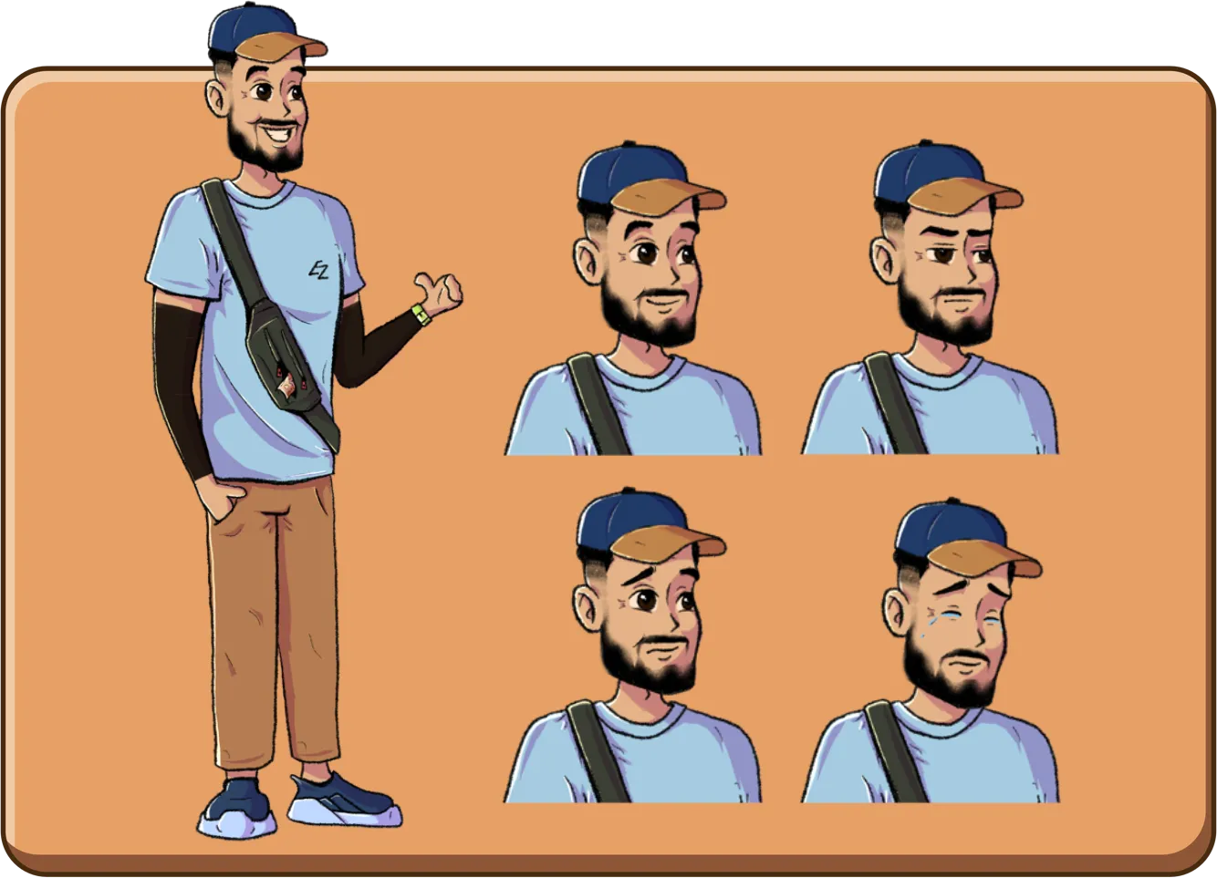
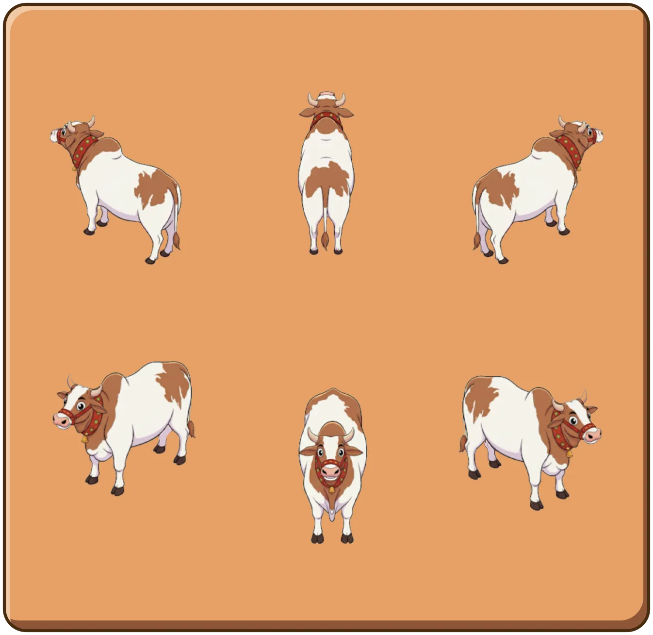
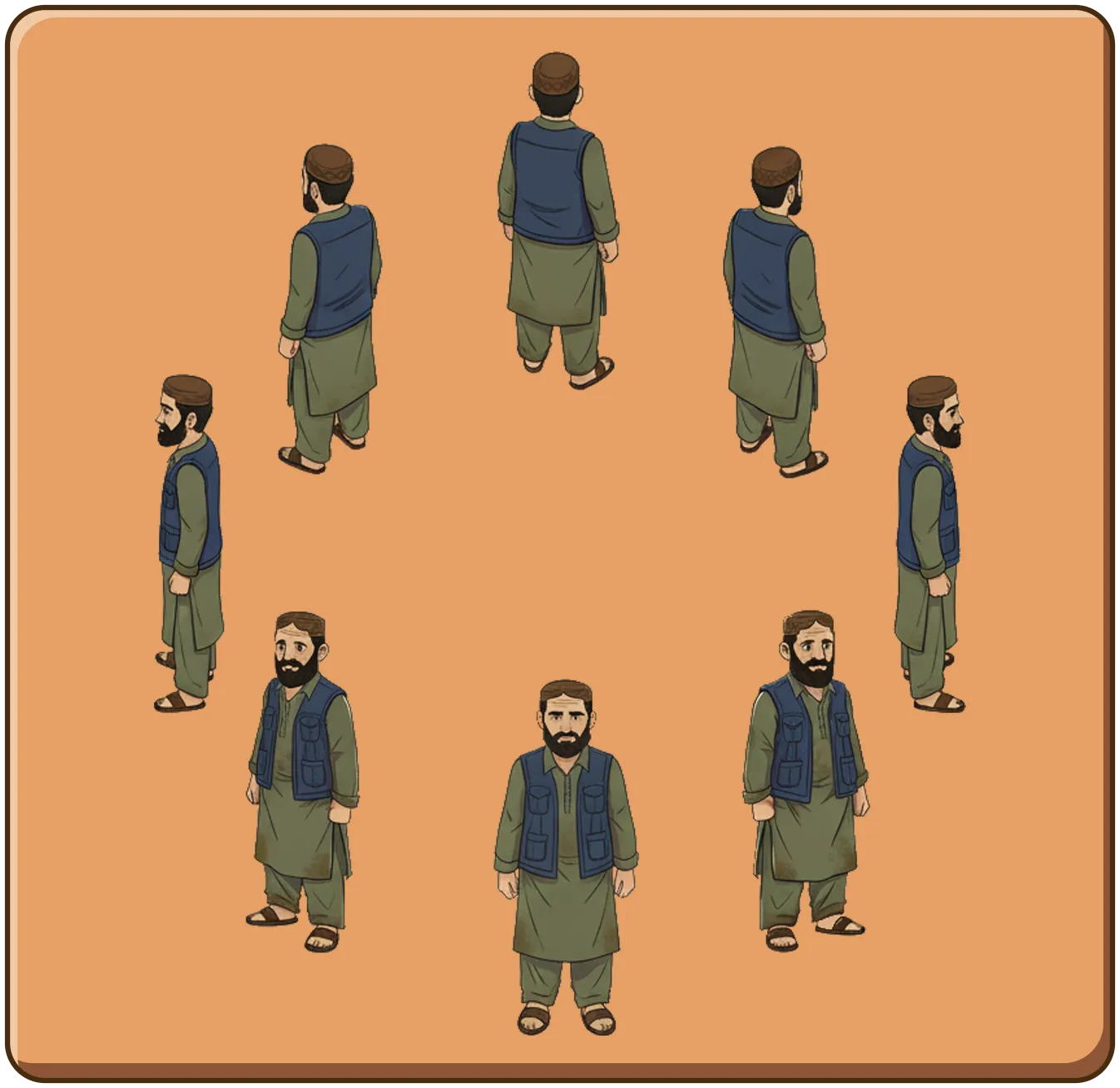
Gaye Mandi

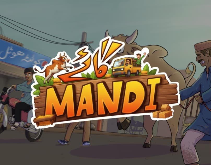
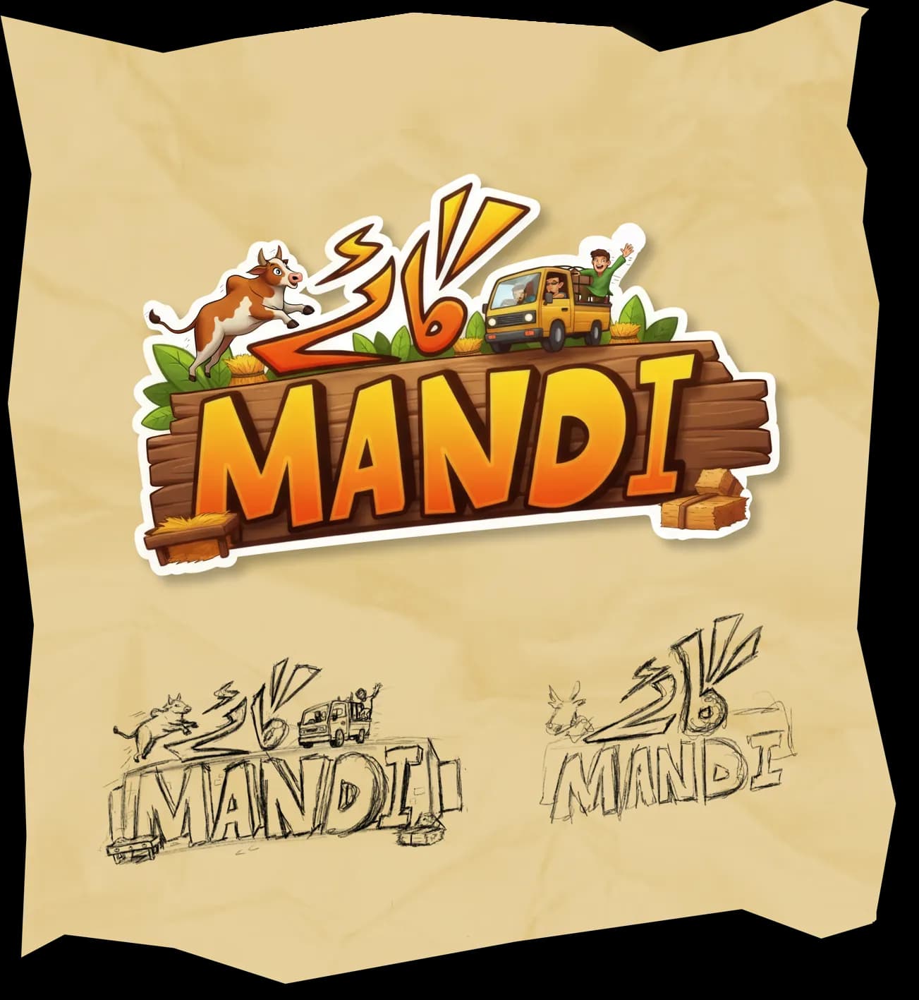
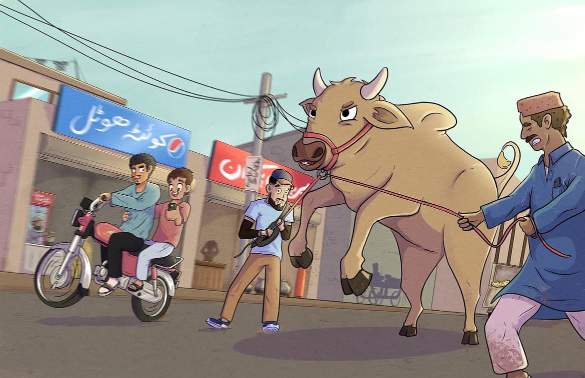
A comprehensive isometric visual experience designed to connect overseas Pakistani children with the cultural atmosphere of Bakra Eid in Karachi.

Technical Documentation
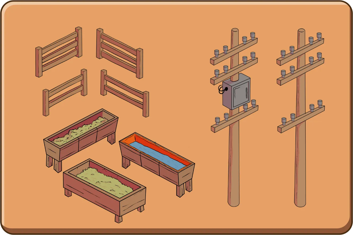
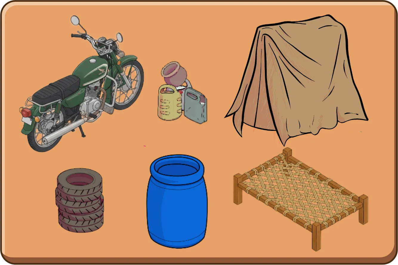
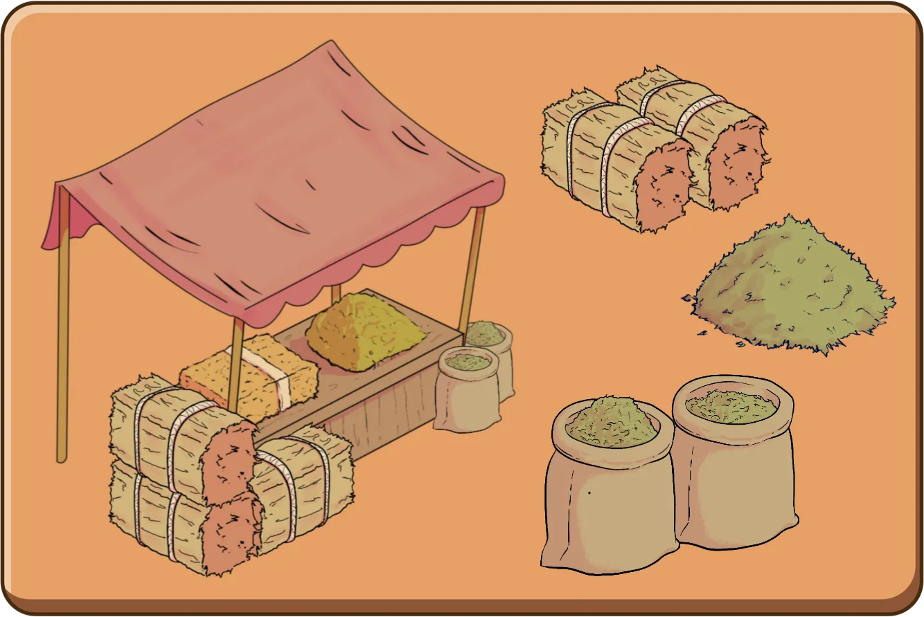
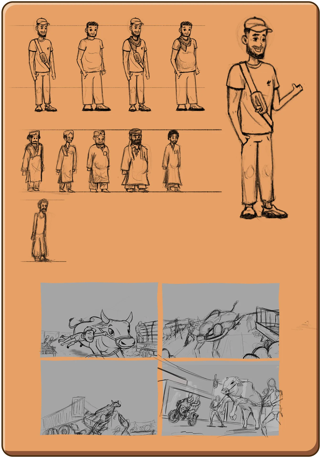
Gaye Mandi is an isometric game project for which our studio created the complete visual experience. The game was developed for a Pakistani foreign school to help overseas Pakistani children connect with and enjoy the cultural atmosphere of Bakra Eid. Set in Karachi, the game reflects the city’s vibrant markets, festive streets, and everyday life through a warm and culturally rich visual style. Our studio handled all major visual components, including splash art, game Assets, character design, environment design, props design, and UI design. Each asset was carefully crafted to maintain clarity within the isometric view while preserving cultural authenticity. The overall visual direction focuses on making Pakistani traditions approachable, educational, and enjoyable for a younger international audience.
Zahra Adventure - 1
Zahra Adventure - 2
Zahra Adventure - 3
Zahra Adventure - 4
Zahra Adventure - 5
Zahra Adventure - 6
Project Analysis

Zahra Adventure

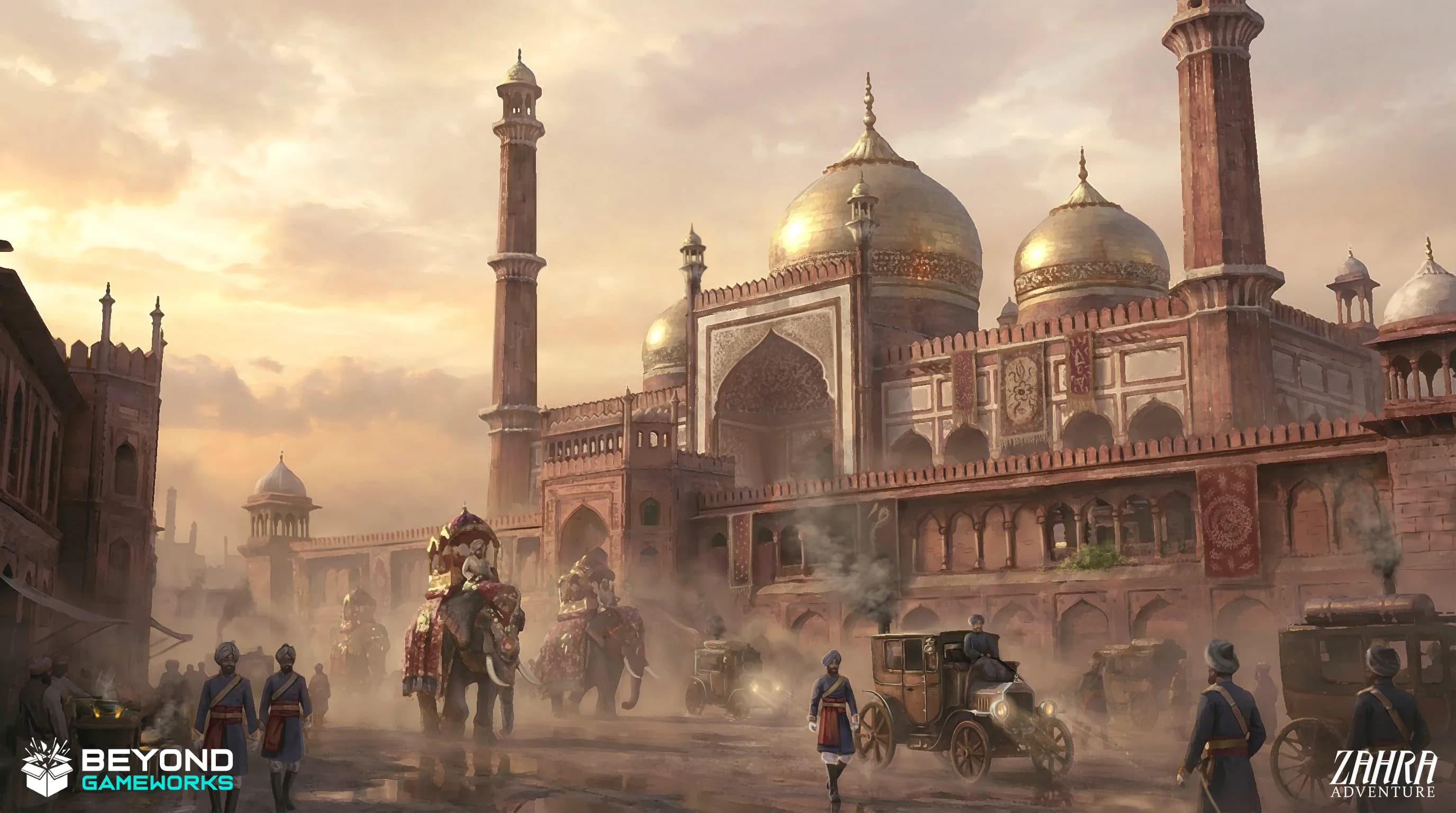
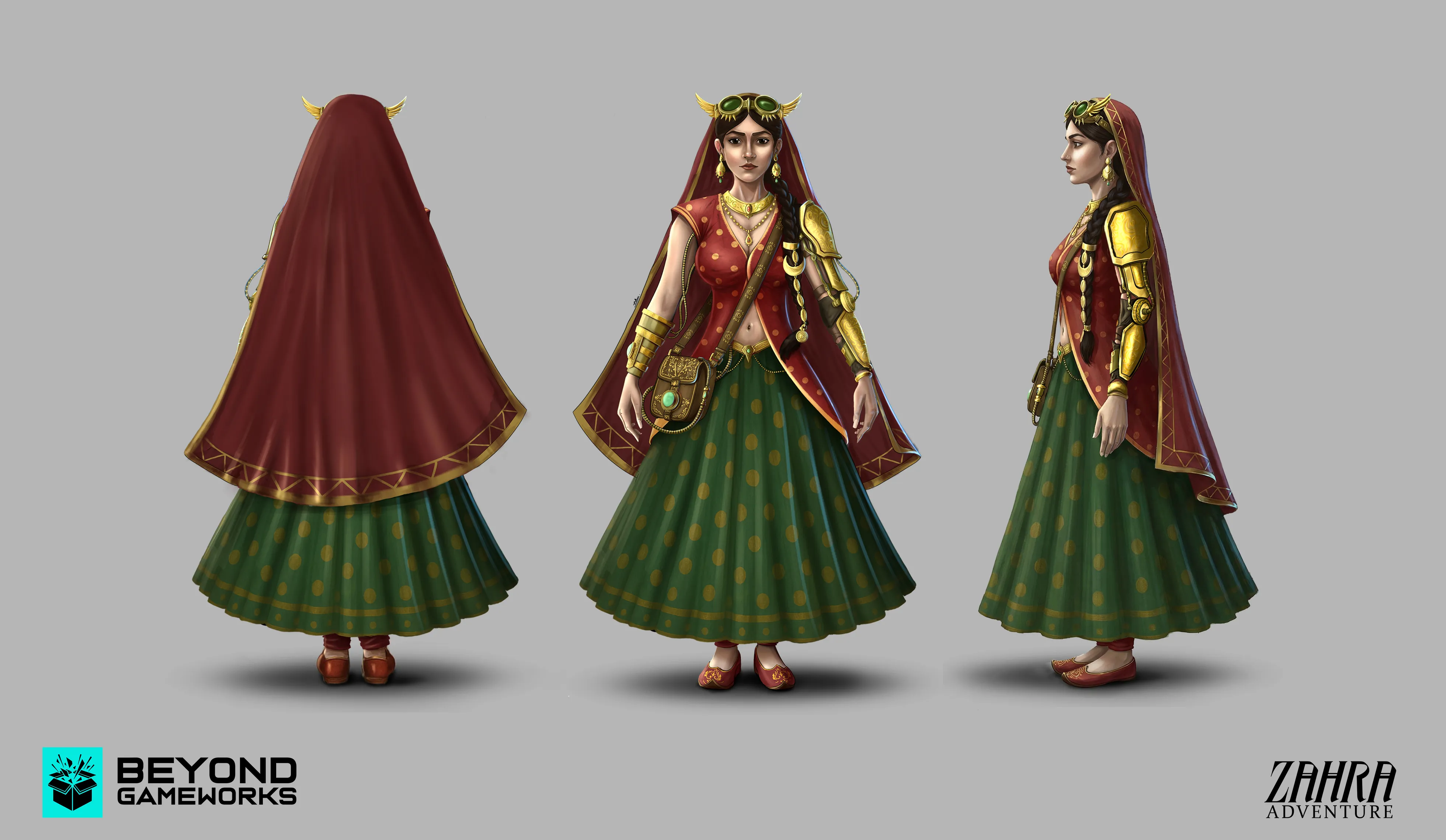
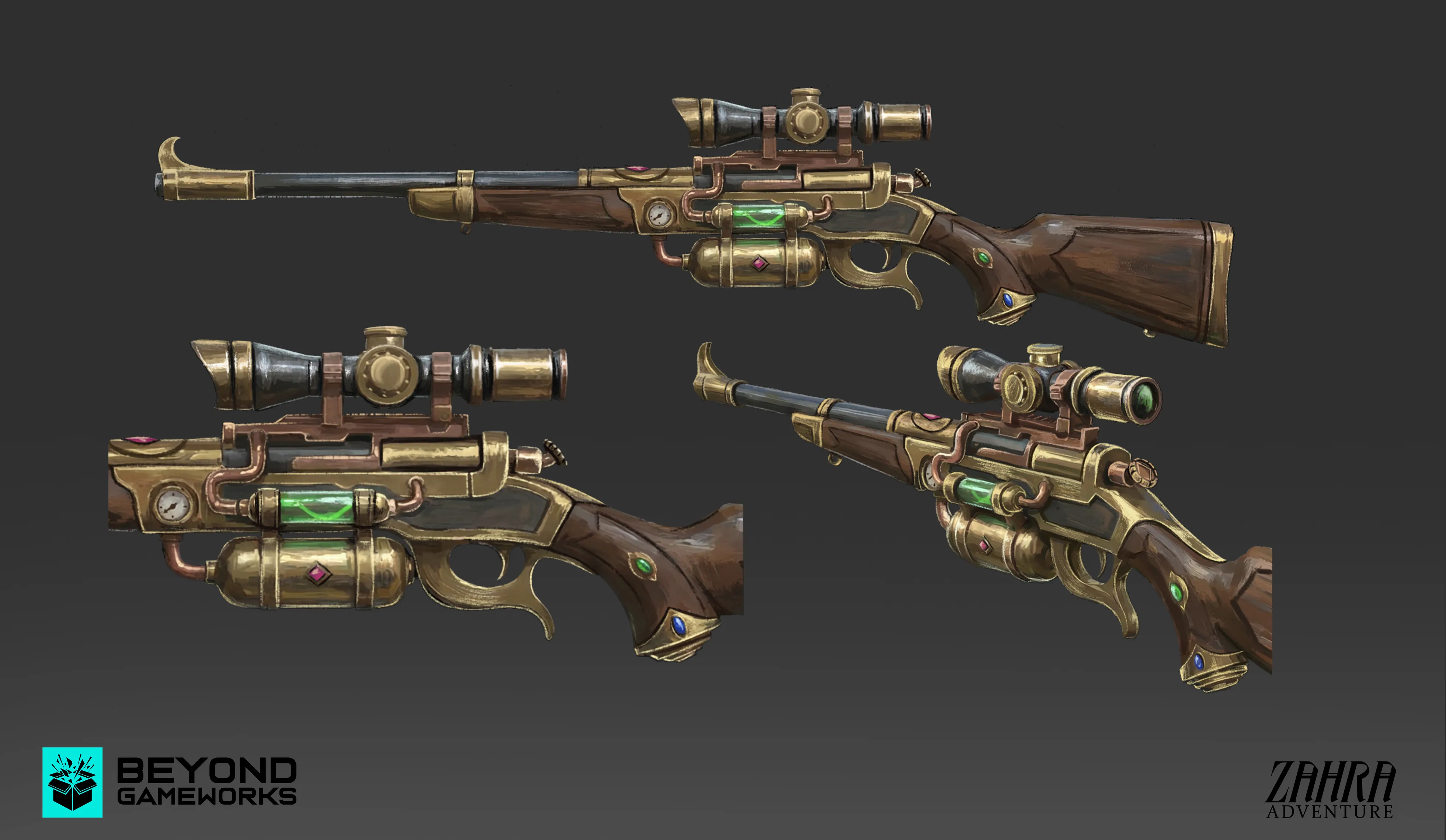
A unique fusion of Mughal era aesthetics and steampunk fantasy, featuring intricate character, environment, and weapon designs that blend history with imaginative technology.

Technical Documentation
Zahra Adventure is an under construction game project developed with a unique fusion of Mughal era aesthetics and steampunk fantasy. Our studio is responsible for creating key visual assets for the game, including character design, weapon design, and environment design. The artistic direction focuses on combining rich Mughal cultural elements with mechanical and industrial steampunk details to build a distinctive and immersive world. Due to NDA limitations, only a small portion of our work can be publicly showcased at this time. The visuals presented represent the foundation of the project’s art direction, highlighting the blend of historical influence and imaginative technology. Our team continues to actively work on this project, with more content planned as development moves forward.
Mafia Car Parking - 1
Mafia Car Parking - 2
Mafia Car Parking - 3
Mafia Car Parking - 4
Mafia Car Parking - 5
Project Analysis

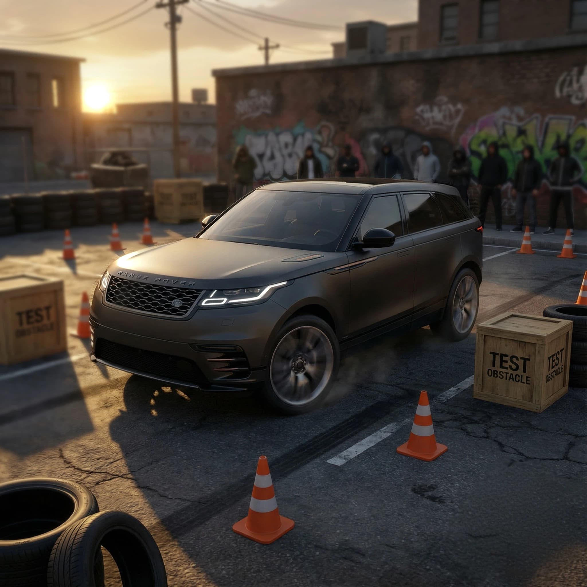
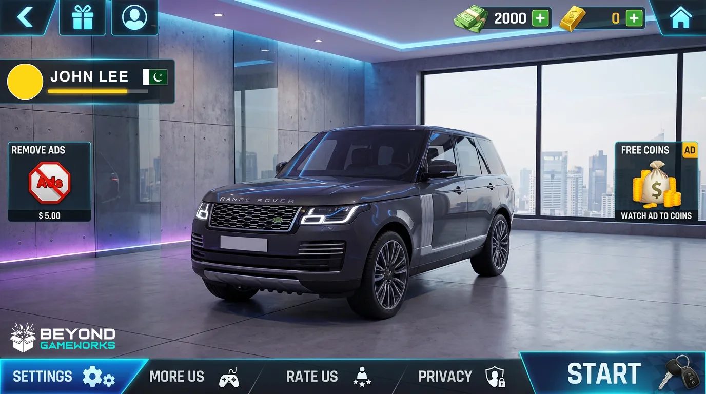
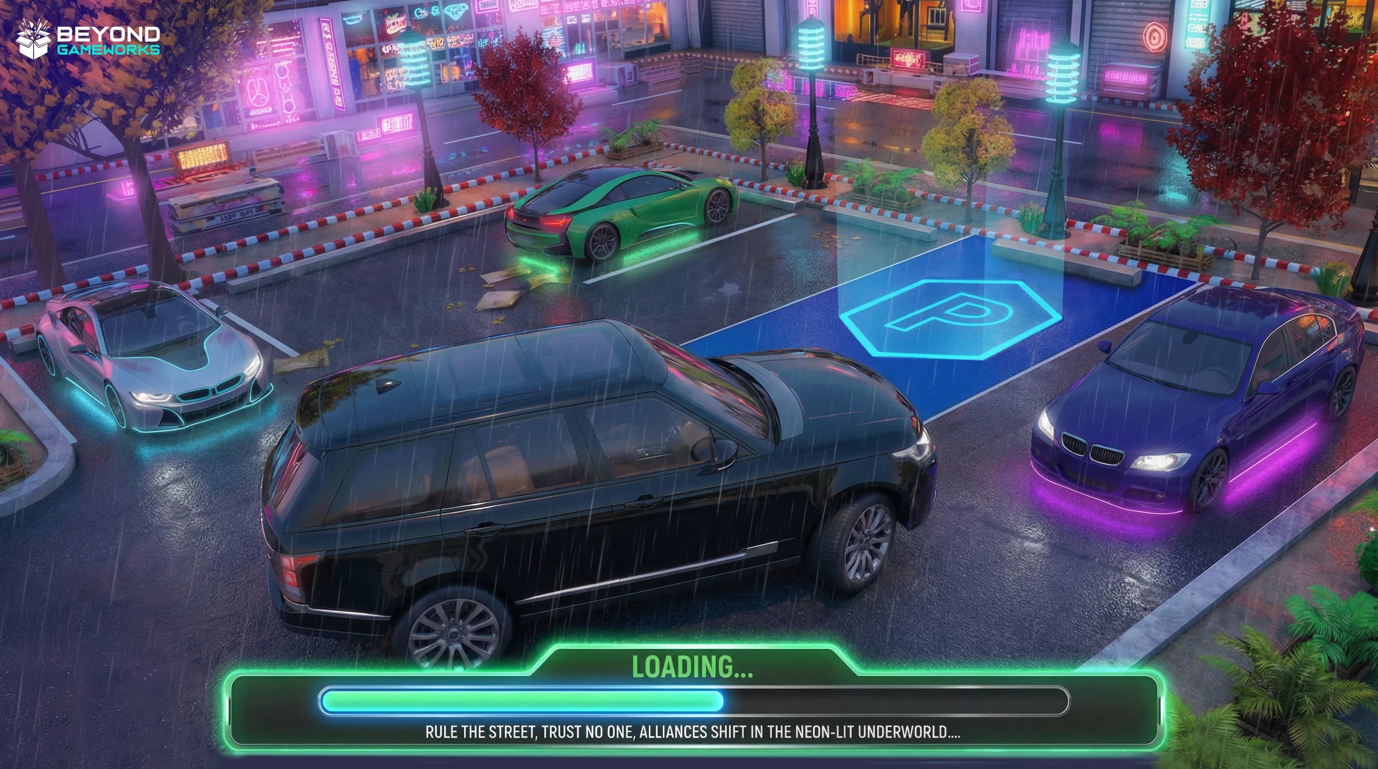
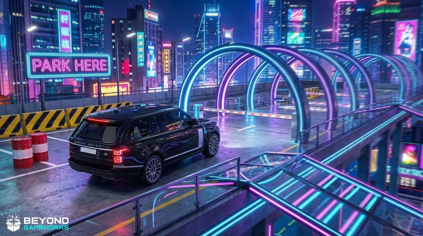
Mafia Car Parking

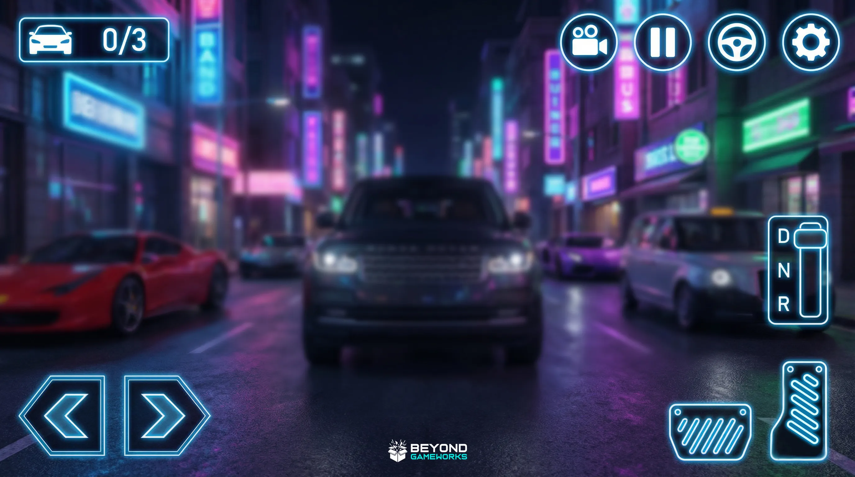
Complete UI system and asset design for a mobile parking game featuring high-energy neon visuals and a stylish mafia-themed atmosphere.

Technical Documentation
Mafia Car Parking is a mobile game project set in a neon city environment, combining a mafia themed atmosphere with modern urban visuals. Our studio focused on creating a bold and stylish presentation that reflects night time city life, glowing lights, and a high energy street vibe, while keeping the interface clear and functional for mobile gameplay. In this project, we designed the complete UI system, in game HUD, splash art, and Play Store assets, including the game icon and promotional images. Neon colors, sharp contrasts, and futuristic accents were used to enhance the city theme and strengthen the game’s visual identity. The final result is a cohesive and eye catching visual package optimized for mobile platforms.
Li Wei – The Vigilante of Shanghai - 1
Li Wei – The Vigilante of Shanghai - 2
Li Wei – The Vigilante of Shanghai - 3
Li Wei – The Vigilante of Shanghai - 4
Li Wei – The Vigilante of Shanghai - 5
Li Wei – The Vigilante of Shanghai - 6
Project Analysis

Li Wei – The Vigilante of Shanghai

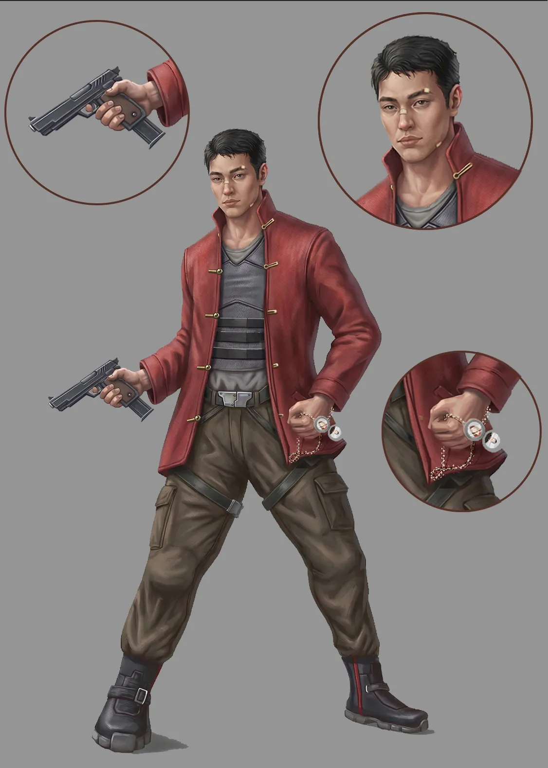
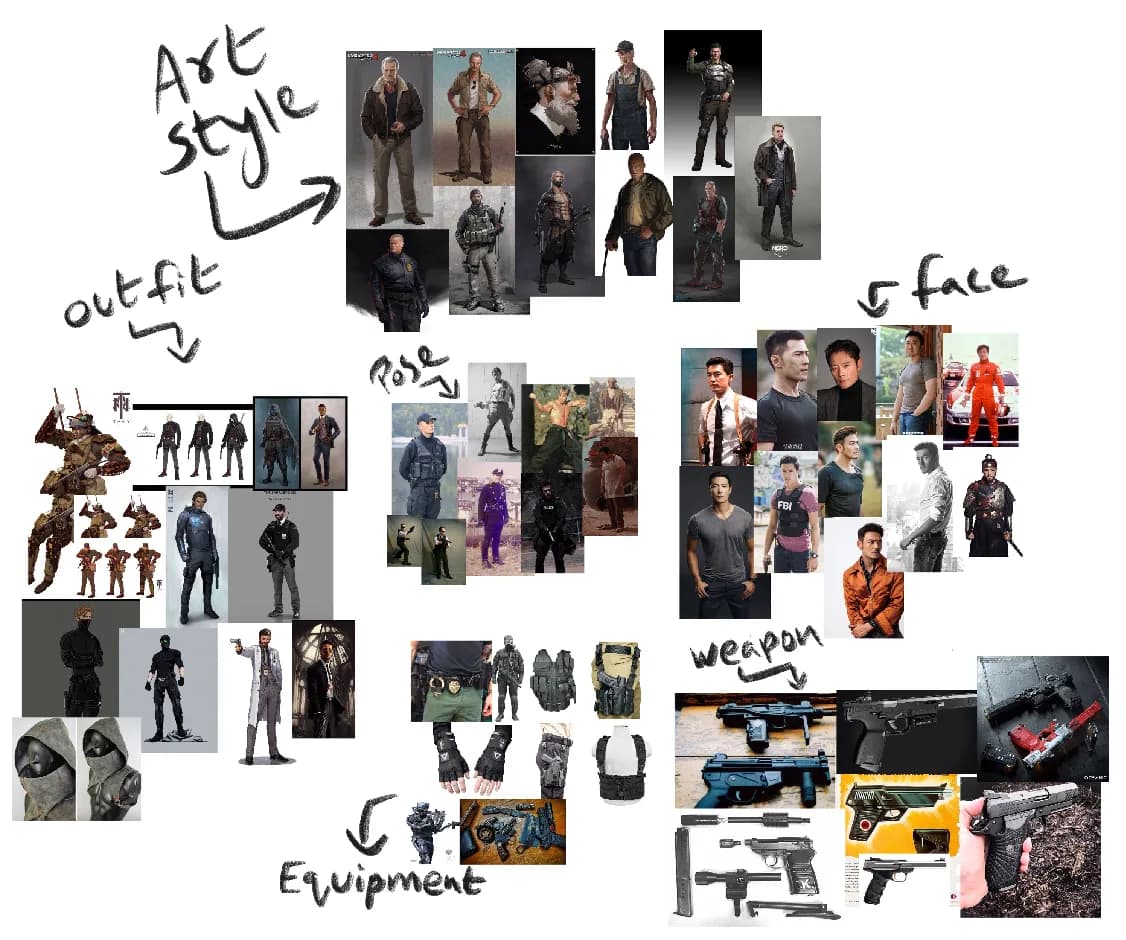
A deep dive into character and prop design for Li Wei, a masked vigilante in neon-lit Shanghai whose outfit and gear blend Chinese tradition with tactical purpose.

Technical Documentation
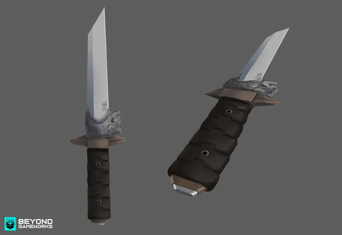
Li Wei, a former police officer in Shanghai, lost everything when a corrupt system failed to bring his family’s killers to justice. Disappearing from the public eye, he returns as a masked vigilante, determined to take down the city’s criminal underworld and corrupt officials. With the skills of a trained officer and the spirit of an ancient warrior, Li Wei wages a relentless war in the shadows of Shanghai. His mission: to restore justice and redeem a city on the brink of chaos. In the neon-lit streets, he fights not for glory, but to protect the soul of the city he once swore to defend. Li Wei’s outfit fuses tradition with purpose. His jacket, inspired by the Mandarin coat, honors his Chinese roots while concealing secret pockets for his gear. Beneath it, a bulletproof vest underscores the dangers he faces as a vigilante. The design reflects a broken man, driven by loss and seeking revenge, blending cultural elegance with the grim reality of his mission. Li Wei’s Combat Knife: Li Wei’s combat knife is a deadly blend of tradition and modernity. The blade is designed with influences from traditional Chinese knives, featuring sleek, modern enhancements for tactical efficiency. Engraved on the blade in Chinese is the word “revenge,” symbolizing its sole purpose. This knife is not just a weapon; it’s a deeply personal tool, reserved for delivering justice in Li Wei’s quest for vengeance.
Sniper Game UI Design - 1
Sniper Game UI Design - 2
Sniper Game UI Design - 3
Sniper Game UI Design - 4
Sniper Game UI Design - 5
Project Analysis

Sniper Game UI Design

Tactical and immersive UI design for a sniper game inspired by Pakistan Special Forces, focusing on military precision and discipline.

Technical Documentation

This sniper game UI design project is inspired by Pakistan Special Forces and their tactical operations against terrorism. The interface was designed to reflect discipline, precision, and military authority, aligning closely with the theme of modern combat. A rigid and dark visual style was chosen to convey seriousness and intensity, while maintaining clear readability during high pressure gameplay moments. The result is a clean, tactical, and immersive user interface that supports sniper based gameplay while reinforcing the game’s military identity.

Ready to Start
Your Journey?